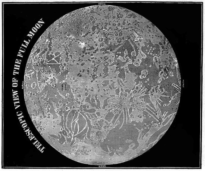
image from Chuck Wood
It was common in the 18th and 19th centuries for compendias and encyclopedias to be published, condensing vast amounts of knowledge (or so said their advertisements) into single volumes. These books often contained woodcuts that had been copied from copies of copies, and hence became more and more distorted. Here is a prime example from 1849: Smith’s Illustrated Astronomy. The first thing to notice to begin to figure out this horrible mess is that, despite saying North at the top, that direction is really east (or west as it was labelled before 1960). To make it easier, I have rotated the image 90 degrees to the left (now south up) so you can begin to recognize features. Mare Imbrium is at bottom right, with Copernicus looking like a component on a printed circuit board with electrical leads radiating away. Don’t confuse it with Archimedes, another component with black subradial lines, even though the crater lacks rays. Plato is misplaced as a peninsula near Sinus Iridum, and Mare Humorum has sprouted islands. The ancestry of this map is indicated by the bright feature reminescent of the Greek letter phi in Mare Serenitatis. As pointed out for another junk map, this comes from Cassini’s beautiful 1692 chart. If you think we are well beyond such sloppy errors, think how often you see commercial images of the Moon inside out or a first quarter Moon rising at sunset. And look at this recent news article (6th paragraph) to see how a legitimate newspaper mangles modern lunar science.
Yesterday's LPOD: A Control Network Topo Map
Tomorrow's LPOD: Ringed with Almost Nothing Visible
COMMENTS?
Register, Log in, and join in the comments.


