Difference between revisions of "June 1, 2010"
| (4 intermediate revisions by the same user not shown) | |||
| Line 1: | Line 1: | ||
__NOTOC__ | __NOTOC__ | ||
=Atlas Perfectibility?= | =Atlas Perfectibility?= | ||
| + | <!-- Start of content --> | ||
<!-- ws:start:WikiTextHeadingRule:1:<h1> --> | <!-- ws:start:WikiTextHeadingRule:1:<h1> --> | ||
<!-- ws:start:WikiTextLocalImageRule:16:<img src="/file/view/LPOD-Jun1-10.jpg/146116321/LPOD-Jun1-10.jpg" alt="" title="" /> -->[[File:LPOD-Jun1-10.jpg|LPOD-Jun1-10.jpg]]<!-- ws:end:WikiTextLocalImageRule:16 --><br /> | <!-- ws:start:WikiTextLocalImageRule:16:<img src="/file/view/LPOD-Jun1-10.jpg/146116321/LPOD-Jun1-10.jpg" alt="" title="" /> -->[[File:LPOD-Jun1-10.jpg|LPOD-Jun1-10.jpg]]<!-- ws:end:WikiTextLocalImageRule:16 --><br /> | ||
<em>image by [mailto:mauricejscollins@hotmail.com Maurice Collins], Palmerston North, New Zealand</em><br /> | <em>image by [mailto:mauricejscollins@hotmail.com Maurice Collins], Palmerston North, New Zealand</em><br /> | ||
<br /> | <br /> | ||
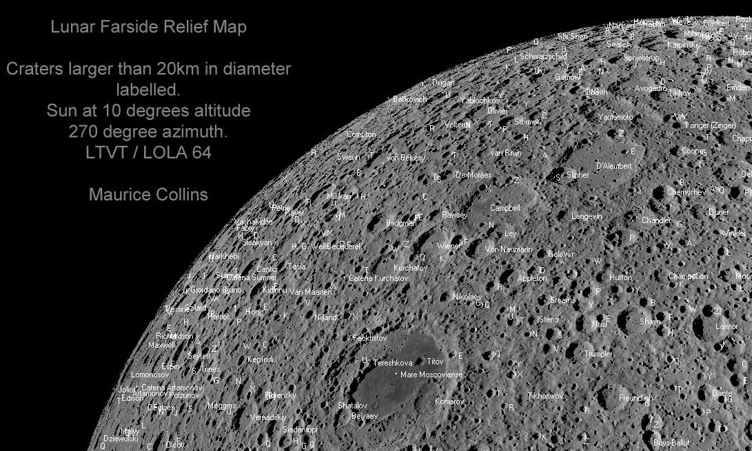
| − | I still get lost on the farside. But now I/we have Maurice's map with nomenclature for farside craters. This small excerpt and the full map were made using Jim Mosher's [http://ltvt.wikispaces.com/LTVT LTVT] to display digital terrain data from the Lunar Reconnaissance Orbiter. The entire map is [ | + | I still get lost on the farside. But now I/we have Maurice's map with nomenclature for farside craters. This small excerpt and the full map were made using Jim Mosher's [http://ltvt.wikispaces.com/LTVT LTVT] to display digital terrain data from the Lunar Reconnaissance Orbiter. The entire map is [https://the-moon.us/wiki/Maurice_Collins%27_Farside_Map here] in <em>The Moon Wiki</em> - caution, it is 1.9 MB. I like the choice of 10° for the illumination because it nicely depicts topography without filling craters with shadows. As a nomenclature map this is quite good in some ways but also frustrating. Near the limbs the curving away surface and names stacked on top of names makes it nearly impossible to identify some named craters. The computer placement of names demonstrates why direct human involvement in map-making is still critical. Humans would not place letters on top of each other. But humans can't do much to improve legibility near the limb. A Mercator projection would eliminate the limb distortions but make comparison with spacecraft images more difficult. Perhaps depicting a globe on a flat surface is no longer how we should think (unless publishing a book). A spinable digital globe, that can be magnified as needed, would be the way to always make the area of interest clearly visible. And in fact, the iPad app [http://itunes.apple.com/us/app/moon-globe/id333180321?mt=8 MoonGlobe] does just that, and so does LTVT and some other programs. This LPOD is not a criticism of the work of Maurice nor Jim, just musings on the perfectibility of lunar nomenclature maps. <br /> |
<br /> | <br /> | ||
<em>[mailto:tychocrater@yahoo.com Chuck Wood]</em><br /> | <em>[mailto:tychocrater@yahoo.com Chuck Wood]</em><br /> | ||
<br /> | <br /> | ||
| + | <p><b>Yesterday's LPOD:</b> [[May 31, 2010|Spirelandia]] </p> | ||
| + | <p><b>Tomorrow's LPOD:</b> [[June 2, 2010|An Exercise for the Student]] </p> | ||
<hr /> | <hr /> | ||
| − | < | + | <table class="wiki_table"> |
| − | < | + | <tr> |
| − | ---- | + | <td> <!-- RemoveRevolverMaps --> |
| − | + | <!-- RemoveRevolverMaps --> | |
| − | + | </td> | |
| + | <!-- End of content --> | ||
| + | {{wiki/ArticleFooter}} | ||
Latest revision as of 18:49, 13 October 2018
Atlas Perfectibility?

image by Maurice Collins, Palmerston North, New Zealand
I still get lost on the farside. But now I/we have Maurice's map with nomenclature for farside craters. This small excerpt and the full map were made using Jim Mosher's LTVT to display digital terrain data from the Lunar Reconnaissance Orbiter. The entire map is here in The Moon Wiki - caution, it is 1.9 MB. I like the choice of 10° for the illumination because it nicely depicts topography without filling craters with shadows. As a nomenclature map this is quite good in some ways but also frustrating. Near the limbs the curving away surface and names stacked on top of names makes it nearly impossible to identify some named craters. The computer placement of names demonstrates why direct human involvement in map-making is still critical. Humans would not place letters on top of each other. But humans can't do much to improve legibility near the limb. A Mercator projection would eliminate the limb distortions but make comparison with spacecraft images more difficult. Perhaps depicting a globe on a flat surface is no longer how we should think (unless publishing a book). A spinable digital globe, that can be magnified as needed, would be the way to always make the area of interest clearly visible. And in fact, the iPad app MoonGlobe does just that, and so does LTVT and some other programs. This LPOD is not a criticism of the work of Maurice nor Jim, just musings on the perfectibility of lunar nomenclature maps.
Chuck Wood
Yesterday's LPOD: Spirelandia
Tomorrow's LPOD: An Exercise for the Student
COMMENTS?
Register, Log in, and join in the comments.


