June 9, 2004
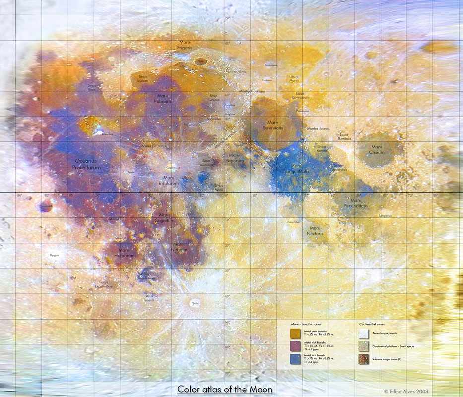
Color Map
Image Credit: Filipe Alves
Color Moon Map The Jan 28 LPOD astonished many observers with its detailed color rendition of the Full Moon. Now that imager, Filipe Alves, has used advanced computer manipulation to create a Mercator-like projection color image of the Moon - the first I know of. This is a level of sophistication that is new to amateur Moon mapping. Here is what the color key at the bottom right says. Left column: Mare- basaltic zones: top gold button = metal poor basalts Ti <2% wt, Fe <15%. Second purple button = metal rich basalts Ti >3%, Fe >15%, Th <6 ppm. Third blue button = metal rich basalts Ti >7%, Fe >15%, Th <4 ppm. The right hand column is labeled Continental zones: top white button = recent impact ejecta, 2nd gray button: continental platform - basin ejecta. Bottom brown button = volcanic origin zones (?). Knowing the difficulty that professional astronomers have in calibrating their images to derive elemental abundances I assume that Filipe has simply calibrated his image against published images such as the map made from the Galileo flyby. Click the image above for a larger view of Filipe's wonderful map. Originally posted March 7, 2004 Related Links: Yesterday's LPOD: Ptolemaeus Tomorrow's LPOD: Peaks of Plato |
Author & Editor:
Charles A. Wood
COMMENTS?
Register, Log in, and join in the comments.


