image from US Library of Congress
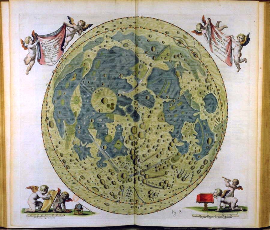
Perhaps the lunar seas are water if they are colored blue. And does the yellow-green mean the highlands are cheese? In fact, I didn’t know that the Hevelius map was colored. The only previous copy I had seen was uncolored. But then I discovered that Hevelius’ great 1647 book Selenographia contained three maps! The one shown on a previous <a href ="http://www.lpod.org/archive/LPOD-2005-05-09.htm">LPOD</a> is not the same map as this one. This apparently is the third chart which shows shadows in all the craters. It also illustrates the beauty of ancient maps - and how often the oldest ones were stylized in their depiction of craters. Plato, Copernicus, Kepler, Tycho, Ptolemaeus and a number of others are recognizable by their locations, but they are all drawn nearly the same. Many of the other craters, especially the small crater chains in the highlands, seem to be more representational than real. I especially like the 6-pack between Tycho and the south pole. But Hevelius used a 50 ft long telescope with only 50 power and no clock drive! We would probably do no better with such equipment. It wasn’t until 1749 that a significantly more accurate (but less attractive) map was drawn by Tobias Mayer using a telescope of only 1.4″ aperture! By the way, when was the last time you saw a cherub on a lunar chart?
Technical Details:
none
Related Links:
Johannes Hevelius (1611-1687)
Yesterday 2.6% of LPOD readers clicked on a sponsor! Thanks!
- SUPPORT LPOD -
VISIT A SPONSOR (CLICK AN AD BELOW) AND LPOD EARNS A FINDER’S FEE!
You can also support LPOD when you buy ANY book from Amazon thru LPOD!
COMMENTS?
Click on this icon File:PostIcon.jpg at the upper right to post a comment.


