April 29, 2004
Greek Letters
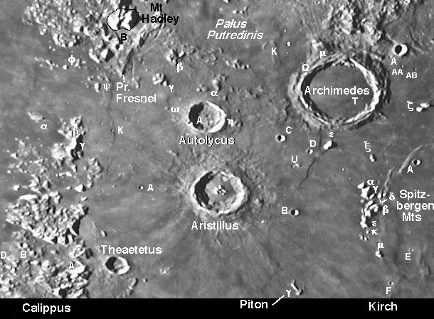
Image Credit: Consolidated Lunar Atlas Sheet B12 |
|
Greek Letters Johann Heinrich Madler, with Teutonic thoroughness and organization, gave letter designations to smaller and less conspicuous features near a named crater. Craters were give upper-case Roman letters - A, B, C, etc - with A usually being the largest or nearest crater, and letters near the end of the alphabet reserved for battered craters. This letter designation system is still official International Astronomical Union nomenclature, but the IAU doesn't keep track of it. One of the last officially approved letter designation is the maps of the System of Lunar Craters (SLC); these maps were republished as Lunar Quadrant Maps and have been available from Sky & Telescope for years. An updated version of the SLC catalog appeared as the NASA Catalog of Lunar Nomenclature, which Jonathan McDowell has entered into an online database. Madler also gave lower-case Greek letters to positive relief features such as mountains, ridges and domes. The last time these features were tabulated was by the IAU in 1935, and when the SLC maps were drafted (I helped make them) each Greek lettered feature was examined and either retained or eliminated, and many additional features were given letters. Unfortunately, we published no catalog of the Greek lettered features; the IAU accepted the SLC as the authority, but later totally abandoned Greek-lettered features. In this LPOD I have transfered the Greek and Roman lettered nomenclature from SLC to a photograph to experiment with developing an unambiguous lunar nomenclature reference document. However, even in this rather uncluttered area of the Moon I found problems. I could not identify all of the lettered craters or peaks that I had helped map 40 years ago! How embarrassing! I think, however, that a proper designed and executed photographic atlas of nomenclature could be an unambiguous reference to existing Greek and Roman letter designation. In the future I will experiment with nomenclature in more congested areas. And we all await the arrival of The Clementine Atlas of the Moon which also includes Roman-lettered features for both near- and far-side craters. Technical Details: This nomenclatural image is far from perfect - the scale is not large enough to unambiguously place all letters, it would be better with a typeface that has a white letter slightly offset from the same letter in black, and some features should be circled - perhaps in a different color - to clarify exactly where they are. Perhaps letters should not be displayed on the image, but individually on mouseover. I think an image map such as this can be less confusing than a drawn map, and there are various ways to optimize such a map. What do you think?Related Links: Yesterday's LPOD: Our Furture on the Moon Tomorrow's LPOD: Kepler |
Author & Editor:
Charles A. Wood
COMMENTS?
Register, Log in, and join in the comments.


