Difference between revisions of "September 15, 2007"

From LPOD
Jump to: navigation, search
(Created page with "__NOTOC__ =Who You Gonna Believe?= <div class="post" id="post-1392"> <div class="storycontent"> <p>Werner-map-LPOD.jpg<br /> <em>map from...")
 
Line 1: Line 1:
 
__NOTOC__
 
__NOTOC__
 
=Who You Gonna Believe?=
 
=Who You Gonna Believe?=
 +
<div class="post" id="post-1392">
  
+
<div class="storycontent">
<div class="post" id="post-1392">
+
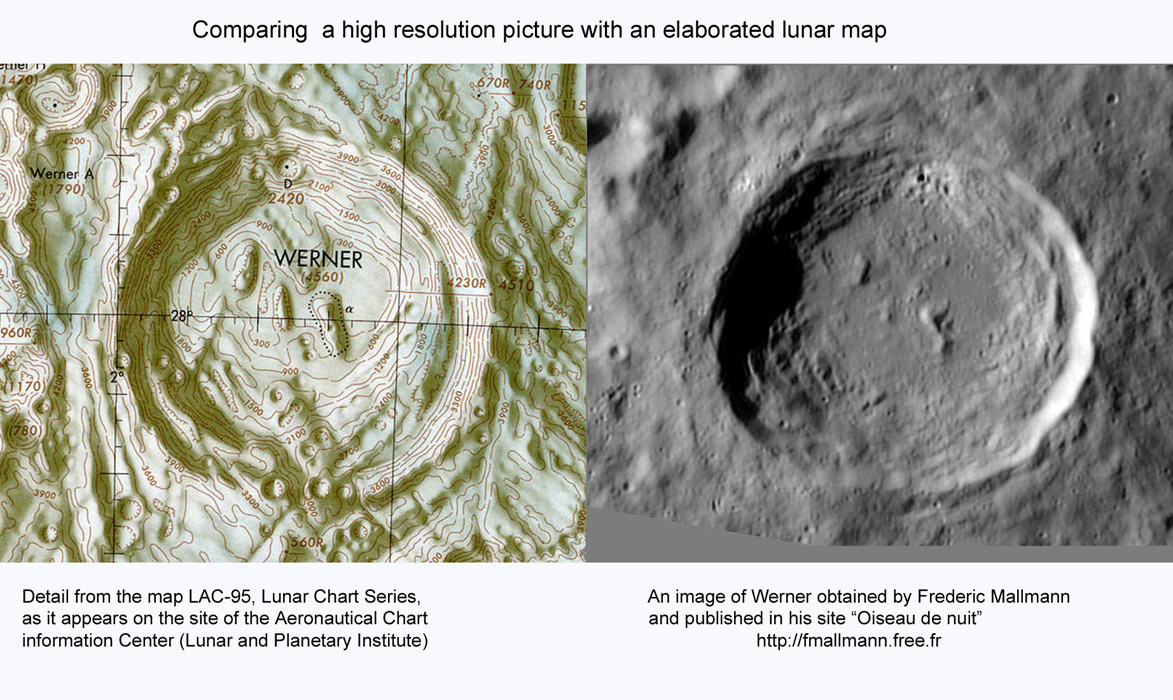
<p>[[File:Werner-map-LPOD.jpg|Werner-map-LPOD.jpg]]<br />
 
<div class="storycontent">
 
<p>[[File:Werner-map-LPOD.jpg|Werner-map-LPOD.jpg]]<br />
 
 
<em>map from LAC 95; image from Frederic Mallmann, submitted by [mailto:leroy-kernoa@wanadoo.fr Jean-Louis Leroy], France</em></p>
 
<em>map from LAC 95; image from Frederic Mallmann, submitted by [mailto:leroy-kernoa@wanadoo.fr Jean-Louis Leroy], France</em></p>
 
<p>The most accurate lunar maps ever made were likely those in the Lunar Aeronautical Chart (LAC) series of the mid-1960s. These were hand-drawn based on the best astronomical images available (including tens of thousands specifically taken for it at Pic du Midi in France), augmented by visual observations with the Lowell Observatory 24&#8243; and Lick Observatory 36&#8243; refractors. And yet, a quick comparison of the LAC map showing Werner with the image reveals many differences. Few convincing arguments can be made that the map is right. I see two ways in which the map is defective. First, it simplifies complex topography - look at the details of wall terraces or floor roughness. Also notice the crater pits on the south rim - they aren&#8217;t there, but the faint topo was interpreted in terms of familiar shapes. Second, the sizes of craters tend to be larger than in reality. The first defect is because the brain does simplify, finding patterns, sometimes when none exists (think martian canals). The second problem is also common - when concentrating on something (like the tiny bright crater on the north rim) we tend to see it larger than it really is. Recognizing how this generally good map departs from reality, is there any doubt that every purported change on the Moon based on comparisons of drawings made at different dates is inherently untrustworthy?</p>
 
<p>The most accurate lunar maps ever made were likely those in the Lunar Aeronautical Chart (LAC) series of the mid-1960s. These were hand-drawn based on the best astronomical images available (including tens of thousands specifically taken for it at Pic du Midi in France), augmented by visual observations with the Lowell Observatory 24&#8243; and Lick Observatory 36&#8243; refractors. And yet, a quick comparison of the LAC map showing Werner with the image reveals many differences. Few convincing arguments can be made that the map is right. I see two ways in which the map is defective. First, it simplifies complex topography - look at the details of wall terraces or floor roughness. Also notice the crater pits on the south rim - they aren&#8217;t there, but the faint topo was interpreted in terms of familiar shapes. Second, the sizes of craters tend to be larger than in reality. The first defect is because the brain does simplify, finding patterns, sometimes when none exists (think martian canals). The second problem is also common - when concentrating on something (like the tiny bright crater on the north rim) we tend to see it larger than it really is. Recognizing how this generally good map departs from reality, is there any doubt that every purported change on the Moon based on comparisons of drawings made at different dates is inherently untrustworthy?</p>
Line 16: Line 14:
 
<p align="center">
 
<p align="center">
 
<i>You can support LPOD when you buy ANY book from Amazon thru [[LPOD]]</i></p>
 
<i>You can support LPOD when you buy ANY book from Amazon thru [[LPOD]]</i></p>
</div>
+
</div>


----
 
----
 
===COMMENTS?===  
 
===COMMENTS?===  
 
Click on this icon [[image:PostIcon.jpg]] at the upper right to post a comment.
 
Click on this icon [[image:PostIcon.jpg]] at the upper right to post a comment.
Revision as of 17:57, 4 January 2015

Who You Gonna Believe?

Werner-map-LPOD.jpg
map from LAC 95; image from Frederic Mallmann, submitted by Jean-Louis Leroy, France

The most accurate lunar maps ever made were likely those in the Lunar Aeronautical Chart (LAC) series of the mid-1960s. These were hand-drawn based on the best astronomical images available (including tens of thousands specifically taken for it at Pic du Midi in France), augmented by visual observations with the Lowell Observatory 24″ and Lick Observatory 36″ refractors. And yet, a quick comparison of the LAC map showing Werner with the image reveals many differences. Few convincing arguments can be made that the map is right. I see two ways in which the map is defective. First, it simplifies complex topography - look at the details of wall terraces or floor roughness. Also notice the crater pits on the south rim - they aren’t there, but the faint topo was interpreted in terms of familiar shapes. Second, the sizes of craters tend to be larger than in reality. The first defect is because the brain does simplify, finding patterns, sometimes when none exists (think martian canals). The second problem is also common - when concentrating on something (like the tiny bright crater on the north rim) we tend to see it larger than it really is. Recognizing how this generally good map departs from reality, is there any doubt that every purported change on the Moon based on comparisons of drawings made at different dates is inherently untrustworthy?

Chuck Wood

Related Links:
Rükl plate 55
For more views of Werner click here
Fredric Mallmann’s website

You can support LPOD when you buy ANY book from Amazon thru LPOD


COMMENTS?

Click on this icon File:PostIcon.jpg at the upper right to post a comment.