Difference between revisions of "March 7, 2004"
(Created page with "__NOTOC__ =Color Moon Map= ---- ===COMMENTS?=== Click on this icon image:PostIcon.jpg at the upper right to post a comment.") |
|||
| (10 intermediate revisions by the same user not shown) | |||
| Line 1: | Line 1: | ||
__NOTOC__ | __NOTOC__ | ||
=Color Moon Map= | =Color Moon Map= | ||
| − | + | <!-- Start of content --> | |
| − | + | <table width="640" border="0" align="center" cellpadding="6" cellspacing="2"> | |
| − | + | <tr> | |
| − | ---- | + | </tr> |
| − | === | + | </table> |
| − | + | <table width="85%" border="0" align="center" cellpadding="6" cellspacing="2"> | |
| + | <tr> | ||
| + | <td colspan="2"><div align="center"> | ||
| + | [[File:LPOD-2004-03-07.jpeg|LPOD-2004-03-07.jpeg]]</div> | ||
| + | </td> | ||
| + | </tr> | ||
| + | </table> | ||
| + | <table width="100%" border="0" cellpadding="8"> | ||
| + | <tr> | ||
| + | <td><div align="center"><p>Image Credit: [mailto:filipe@pixmix.tv Filipe Alves]</p></div></td> | ||
| + | </tr> | ||
| + | </table> | ||
| + | <table class="story" border="0" bgcolor="#FFFFFF" width="90%" cellpadding="10" align="center"><tr><td> | ||
| + | <p class="story" align="center"><b>Color Moon Map </b></p> | ||
| + | <p class="story" align="left"> | ||
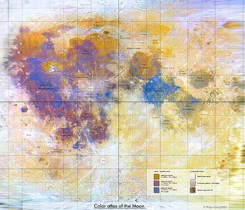
| + | The Jan 28 [[January_28,_2004|LPOD]] astonished many observers with its detailed color rendition | ||
| + | of the Full Moon. Now that imager, Filipe Alves, has used advanced computer manipulation to create a Mercator-like | ||
| + | projection color image of the Moon - the first I know of. This is a level of sophistication that is new to | ||
| + | amateur Moon mapping. Here is what the color key at the bottom right says. Left column: Mare- basaltic zones: top | ||
| + | gold button = metal poor basalts Ti <2% wt, Fe <15%. Second purple button = metal rich basalts Ti >3%, Fe >15%, | ||
| + | Th <6 ppm. Third blue button = metal rich basalts Ti >7%, Fe >15%, Th <4 ppm. The right hand column is labeled | ||
| + | Continental zones: top white button = recent impact ejecta, 2nd gray button: continental platform - basin ejecta. | ||
| + | Bottom brown button = volcanic origin zones (?). Knowing the difficulty that professional astronomers have in | ||
| + | calibrating their images to derive elemental abundances I assume that Filipe has simply calibrated his image | ||
| + | against published images such as the map made from the Galileo flyby. Click the image above for a larger view of | ||
| + | Filipe's wonderful map. | ||
| + | </p> | ||
| + | <p class="story"><b>Related Links:</b><br> | ||
| + | [http://discovery.scifi-art.com/tstexture/ UV Projections]<br> | ||
| + | [http://www.psrd.hawaii.edu/Oct97/MoonFeO.html Calibrating lunar images]</p> | ||
| + | <p><b>Yesterday's LPOD:</b> [[March 6, 2004|Goodacre's Imbrium]] </p> | ||
| + | <p><b>Tomorrow's LPOD:</b> [[March 8, 2004|Sunset Over Clavius]] </p> | ||
| + | </td></tr> | ||
| + | </table> | ||
| + | <!-- start bottom --> | ||
| + | <table width="100%" border="0" cellspacing="2" cellpadding="4"> | ||
| + | <tr> | ||
| + | <td><hr></td> | ||
| + | </tr> | ||
| + | <tr> | ||
| + | <td> | ||
| + | <p align="center" class="main_titles"><b>Author & Editor:</b><br> | ||
| + | [mailto:tychocrater@yahoo.com Charles A. Wood]</p> | ||
| + | <!-- Cleanup of credits --> | ||
| + | <!-- Cleanup of credits --> | ||
| + | <!-- Cleanup of credits --> | ||
| + | <!-- Cleanup of credits --> | ||
| + | <!-- Cleanup of credits --> | ||
| + | <!-- Cleanup of credits --> | ||
| + | <!-- Cleanup of credits --> | ||
| + | </tr> | ||
| + | </table> | ||
| + | <p> </p> | ||
| + | <!-- End of content --> | ||
| + | {{wiki/ArticleFooter}} | ||
Latest revision as of 18:13, 7 February 2015
Color Moon Map
Image Credit: Filipe Alves |
|
Color Moon Map The Jan 28 LPOD astonished many observers with its detailed color rendition of the Full Moon. Now that imager, Filipe Alves, has used advanced computer manipulation to create a Mercator-like projection color image of the Moon - the first I know of. This is a level of sophistication that is new to amateur Moon mapping. Here is what the color key at the bottom right says. Left column: Mare- basaltic zones: top gold button = metal poor basalts Ti <2% wt, Fe <15%. Second purple button = metal rich basalts Ti >3%, Fe >15%, Th <6 ppm. Third blue button = metal rich basalts Ti >7%, Fe >15%, Th <4 ppm. The right hand column is labeled Continental zones: top white button = recent impact ejecta, 2nd gray button: continental platform - basin ejecta. Bottom brown button = volcanic origin zones (?). Knowing the difficulty that professional astronomers have in calibrating their images to derive elemental abundances I assume that Filipe has simply calibrated his image against published images such as the map made from the Galileo flyby. Click the image above for a larger view of Filipe's wonderful map. Related Links: Yesterday's LPOD: Goodacre's Imbrium Tomorrow's LPOD: Sunset Over Clavius |
|
Author & Editor: |
COMMENTS?
Register, Log in, and join in the comments.


