Difference between revisions of "March 7, 2004"
| Line 1: | Line 1: | ||
__NOTOC__ | __NOTOC__ | ||
=Color Moon Map= | =Color Moon Map= | ||
| − | |||
| − | |||
<table width="640" border="0" align="center" cellpadding="6" cellspacing="2"> | <table width="640" border="0" align="center" cellpadding="6" cellspacing="2"> | ||
| − | + | <tr> | |
| − | + | </tr> | |
| − | |||
| − | |||
| − | |||
</table> | </table> | ||
<table width="85%" border="0" align="center" cellpadding="6" cellspacing="2"> | <table width="85%" border="0" align="center" cellpadding="6" cellspacing="2"> | ||
| − | + | <tr> | |
| − | + | <td colspan="2"><div align="center"> | |
| − | + | [[File:LPOD-2004-03-07.jpeg|LPOD-2004-03-07.jpeg]]</div> | |
| − | + | </td> | |
| − | + | </tr> | |
| − | |||
</table> | </table> | ||
<table width="100%" border="0" cellpadding="8"> | <table width="100%" border="0" cellpadding="8"> | ||
| − | + | <tr> | |
| − | + | <td><div align="center" span class="main_sm">Image Credit: [mailto:filipe@pixmix.tv Filipe Alves]</div></td> | |
| − | + | </tr> | |
</table> | </table> | ||
| − | |||
<table class="story" border="0" bgcolor="#FFFFFF" width="90%" cellpadding="10" align="center"><tr><td> | <table class="story" border="0" bgcolor="#FFFFFF" width="90%" cellpadding="10" align="center"><tr><td> | ||
| − | + | <p class="story" align="center"><b>Color Moon Map </b></p> | |
| − | + | <p class="story" align="left"> | |
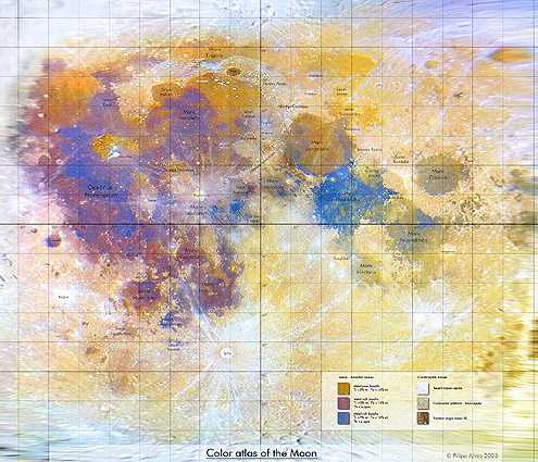
| − | + | The Jan 28 [../01/LPOD-2004-01-28.htm LPOD] astonished many observers with its detailed color rendition | |
| − | + | of the Full Moon. Now that imager, Filipe Alves, has used advanced computer manipulation to create a Mercator-like | |
| − | + | projection color image of the Moon - the first I know of. This is a level of sophistication that is new to | |
| − | + | amateur Moon mapping. Here is what the color key at the bottom right says. Left column: Mare- basaltic zones: top | |
| − | + | gold button = metal poor basalts Ti <2% wt, Fe <15%. Second purple button = metal rich basalts Ti >3%, Fe >15%, | |
| − | + | Th <6 ppm. Third blue button = metal rich basalts Ti >7%, Fe >15%, Th <4 ppm. The right hand column is labeled | |
| − | + | Continental zones: top white button = recent impact ejecta, 2nd gray button: continental platform - basin ejecta. | |
| − | + | Bottom brown button = volcanic origin zones (?). Knowing the difficulty that professional astronomers have in | |
| − | + | calibrating their images to derive elemental abundances I assume that Filipe has simply calibrated his image | |
| − | + | against published images such as the map made from the Galileo flyby. Click the image above for a larger view of | |
| − | + | Filipe's wonderful map. | |
| − | + | </p> | |
| − | + | <p class="story"><b>Related Links:</b><br> | |
| − | |||
| − | |||
| − | |||
| − | |||
[http://discovery.scifi-art.com/tstexture/ UV Projections]<br> | [http://discovery.scifi-art.com/tstexture/ UV Projections]<br> | ||
[http://www.psrd.hawaii.edu/Oct97/MoonFeO.html Calibrating lunar images]</p> | [http://www.psrd.hawaii.edu/Oct97/MoonFeO.html Calibrating lunar images]</p> | ||
| − | + | <p class="story"> <b>Tomorrow's LPOD:</b> Sunset Over Clavius</p> | |
| − | + | </td></tr> | |
| − | |||
| − | |||
| − | |||
</table> | </table> | ||
| − | + | <!-- start bottom --> | |
| − | </td></tr> | + | <table width="100%" border="0" cellspacing="2" cellpadding="4"> |
| − | + | <tr> | |
| + | <td><hr></td> | ||
| + | </tr> | ||
<tr> | <tr> | ||
| − | + | <td> | |
| − | + | <p align="center" class="main_titles"><b>Author & Editor:</b><br> | |
| − | + | [mailto:tychocrater@yahoo.com Charles A. Wood]</p> | |
| − | + | <p align="center" class="main_titles"><b>Technical Consultant:</b><br> | |
| − | + | [mailto:anthony@perseus.gr Anthony Ayiomamitis]</p> | |
| − | + | <p align="center" class="main_titles"><b>A service of:</b><br> | |
| − | + | [http://www.observingthesky.org/ ObservingTheSky.Org]</p> | |
| − | + | <p align="center" class="main_titles"><b>Visit these other PODs:</b> <br> | |
| − | + | [http://antwrp.gsfc.nasa.gov/apod/astropix.html Astronomy] | [http://www.msss.com/ Mars] | [http://epod.usra.edu/ Earth]</p></td> | |
| − | + | </tr> | |
| − | |||
| − | |||
| − | |||
| − | |||
| − | |||
| − | |||
| − | |||
| − | |||
</table> | </table> | ||
| − | |||
| − | |||
| − | |||
<p> </p> | <p> </p> | ||
| − | |||
| − | |||
| − | |||
---- | ---- | ||
===COMMENTS?=== | ===COMMENTS?=== | ||
Click on this icon [[image:PostIcon.jpg]] at the upper right to post a comment. | Click on this icon [[image:PostIcon.jpg]] at the upper right to post a comment. | ||
Revision as of 17:16, 4 January 2015
Color Moon Map
Image Credit: Filipe Alves |
|
Color Moon Map The Jan 28 [../01/LPOD-2004-01-28.htm LPOD] astonished many observers with its detailed color rendition of the Full Moon. Now that imager, Filipe Alves, has used advanced computer manipulation to create a Mercator-like projection color image of the Moon - the first I know of. This is a level of sophistication that is new to amateur Moon mapping. Here is what the color key at the bottom right says. Left column: Mare- basaltic zones: top gold button = metal poor basalts Ti <2% wt, Fe <15%. Second purple button = metal rich basalts Ti >3%, Fe >15%, Th <6 ppm. Third blue button = metal rich basalts Ti >7%, Fe >15%, Th <4 ppm. The right hand column is labeled Continental zones: top white button = recent impact ejecta, 2nd gray button: continental platform - basin ejecta. Bottom brown button = volcanic origin zones (?). Knowing the difficulty that professional astronomers have in calibrating their images to derive elemental abundances I assume that Filipe has simply calibrated his image against published images such as the map made from the Galileo flyby. Click the image above for a larger view of Filipe's wonderful map. Related Links: Tomorrow's LPOD: Sunset Over Clavius |
|
Author & Editor: Technical Consultant: A service of: |
COMMENTS?
Click on this icon File:PostIcon.jpg at the upper right to post a comment.


